CURIOUSDECK
Making research feel like discovery
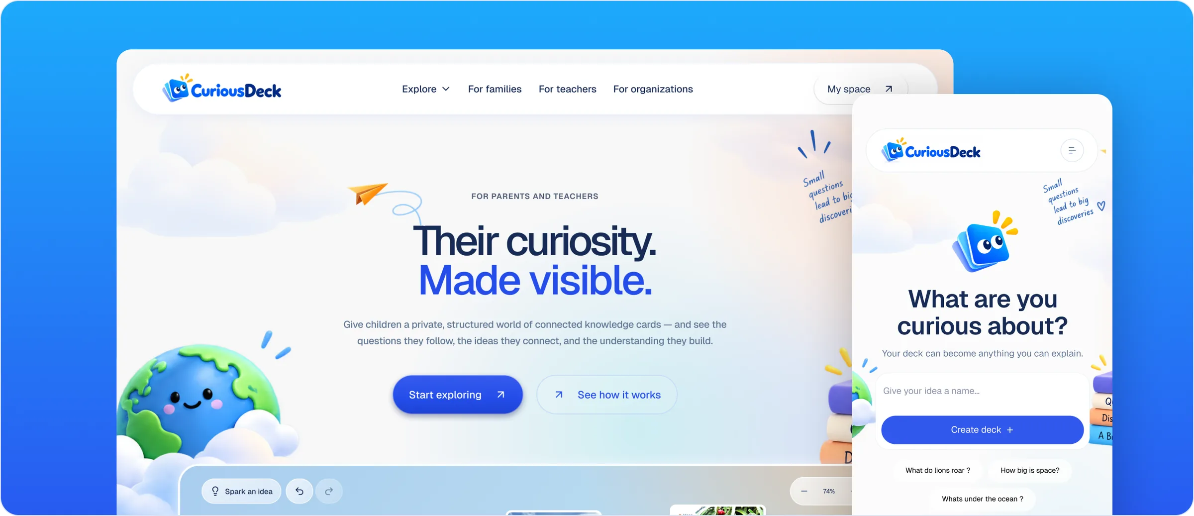
CuriousDeck is a research and discovery platform that helps young learners explore questions, organise what they find and build knowledge through guided activities while giving teachers a clearer way to assign and review their work.
My role: Redesign lead. I owned UX strategy, information architecture, the UI redesign and the visual system.
OVERVIEW
The challenge was not simply making research feel fun. It was giving curiosity enough structure to work inside a classroom.
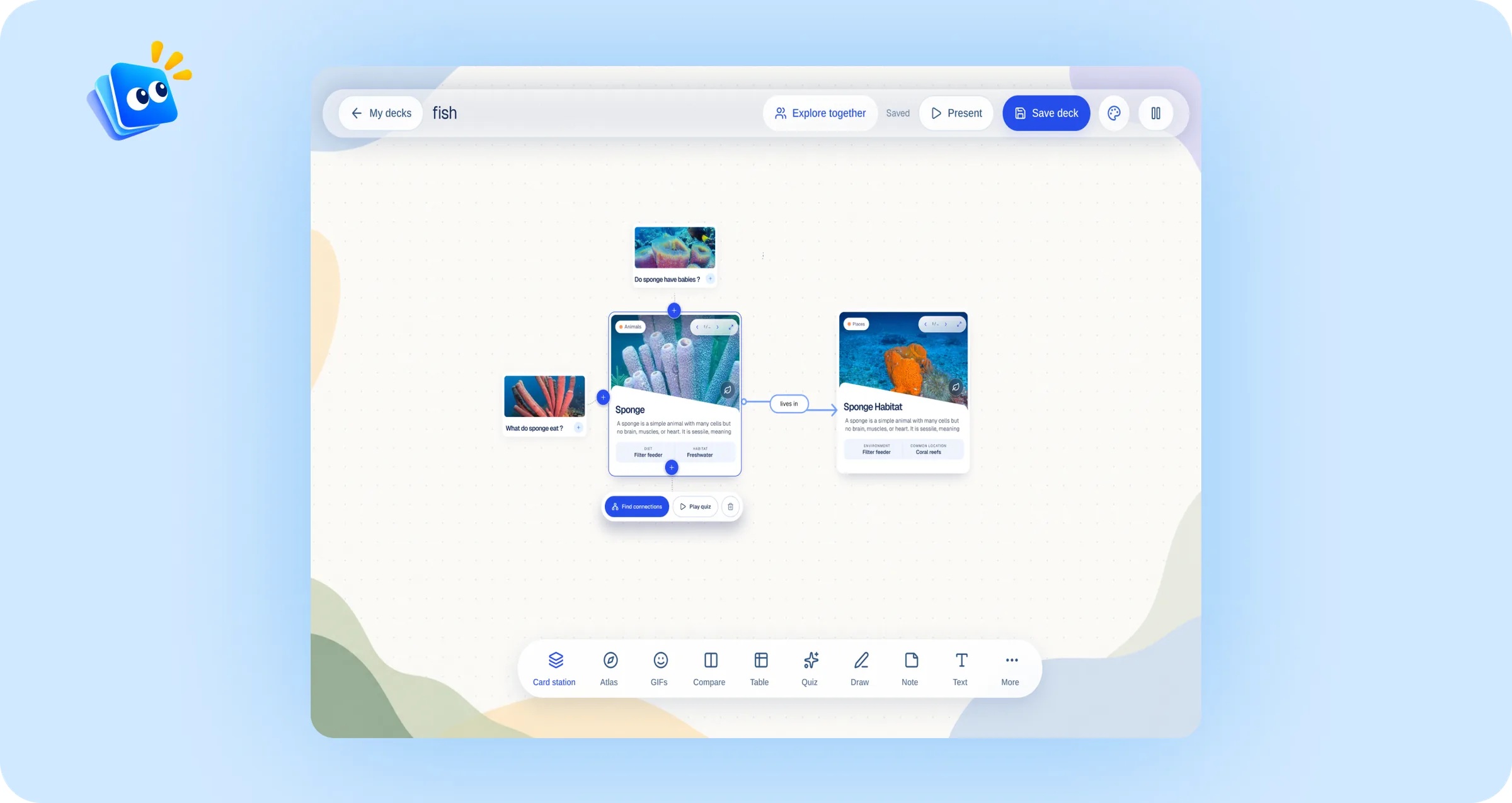
CuriousDeck was created to help young learners explore questions and build knowledge through connected learning decks. The experience needed to encourage open-ended discovery while still giving children enough guidance to understand where to begin and what to do next.
I redesigned the product around clearer spaces for exploring topics, creating decks and reviewing completed learning. The wider experience also considered teachers and schools—giving educators a more structured way to assign activities, guide research and review what students had learned.
- My role
- Product Designer (redesign lead)
- Industry
- EdTech
- Scope
- UX strategy · Information architecture · UI redesign · Visual system
- Year
- 2026
THE PROBLEM
Curiosity is naturally open-ended. The product still needed to make every next step feel clear.
CuriousDeck had to support children who may begin with only a simple question, while giving them enough structure to continue exploring without becoming overwhelmed. At the same time, the platform needed to work for teachers and schools that required more control, visibility and organisation.
The redesign therefore needed to balance freedom with guidance—creating an experience that felt playful to young learners without losing the structure expected from an educational product.
Guide without limiting
Help learners move from one question to the next without controlling what they can explore.
Support different users
Create connected experiences for students, teachers, classes and schools.
Playful, not distracting
Use colour, illustration and personality without competing with the learning content.
KEY DECISIONS
Three decisions shaped the redesign.
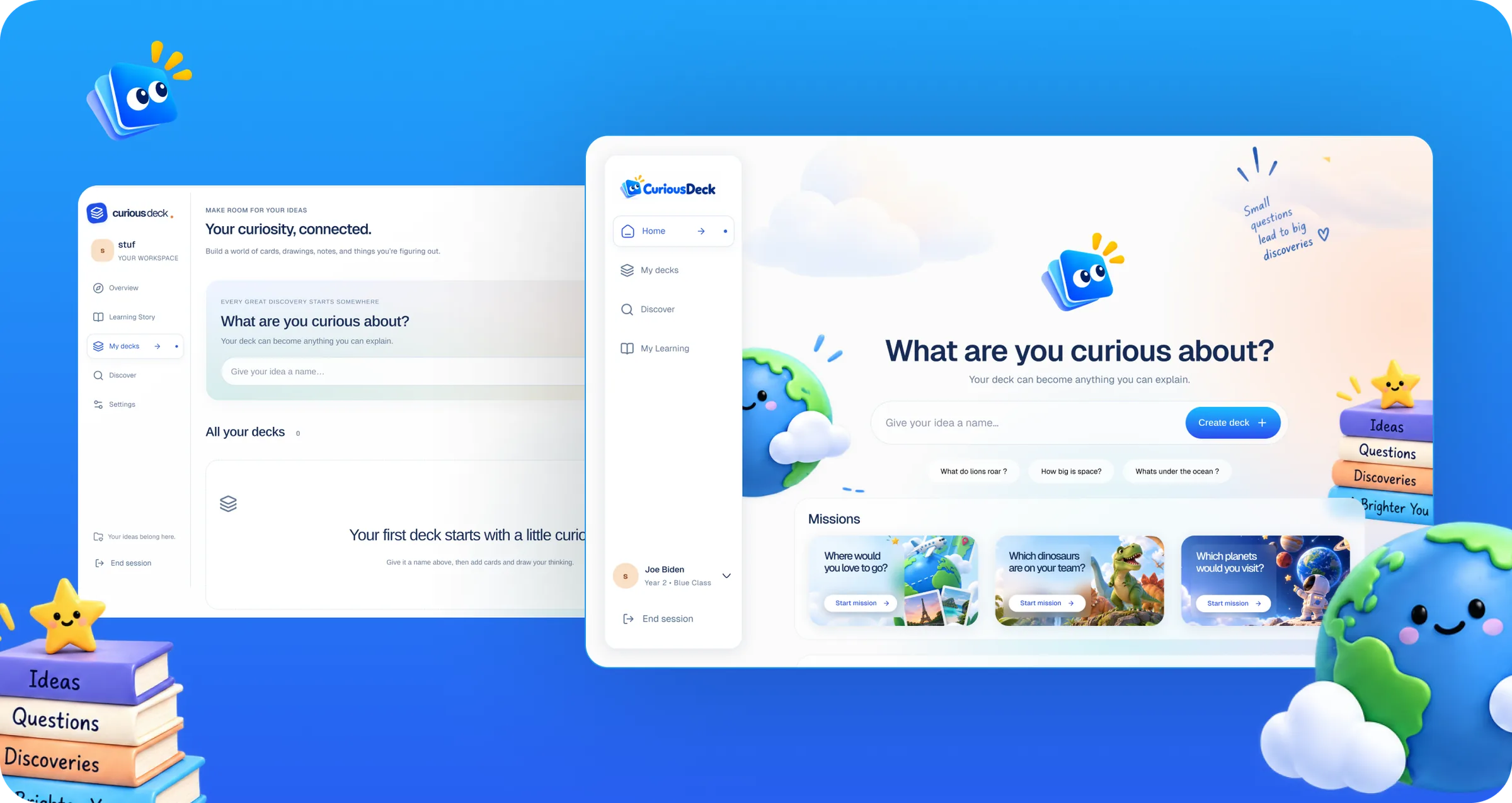
- I replaced an empty-state starting point with a Home built around one question: ‘What are you curious about?’
- I simplified the navigation to four clear spaces: Home, My Decks, Discover and My Learning.
- I introduced a more expressive visual system, but kept it restrained enough that the learning content stays the focus.
REDESIGNING THE STARTING POINT
The original experience made it possible to create a deck. The redesign made children want to begin exploring.
The previous interface was clean and functional, but it felt closer to a general productivity workspace than a learning environment for young children. It relied heavily on an empty state, offered little inspiration and placed the main experience inside My Decks rather than giving learners a true starting point.
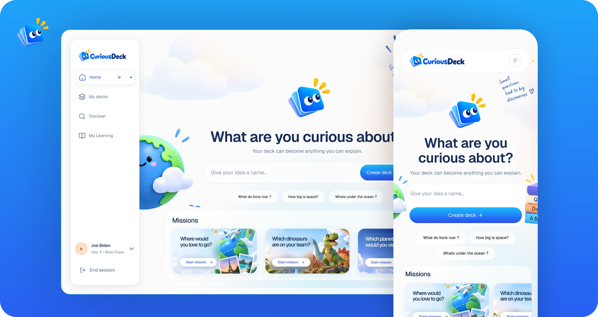
The redesign introduced a dedicated Home experience centred on one clear question: “What are you curious about?” Suggested prompts help children begin when they do not have an idea, while visual missions offer structured ways to explore travel, dinosaurs, space and other topics.
I also simplified the navigation into Home, My Decks, Discover and My Learning, then introduced a more expressive visual system that made the experience feel inviting without hiding the primary action.
GIVING EACH SPACE ONE PURPOSE
The experience became easier to understand when every part of the product had one clear purpose.
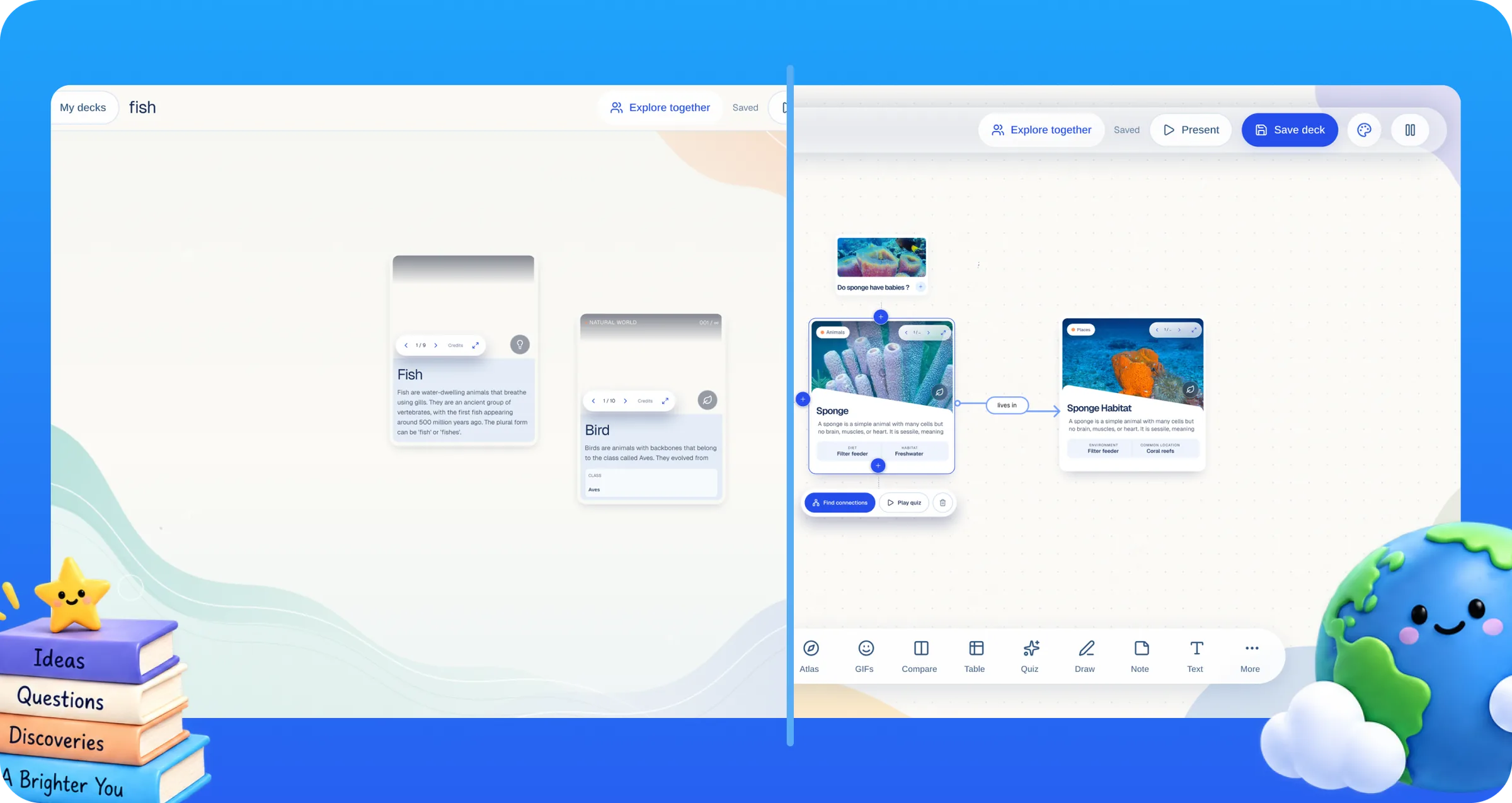
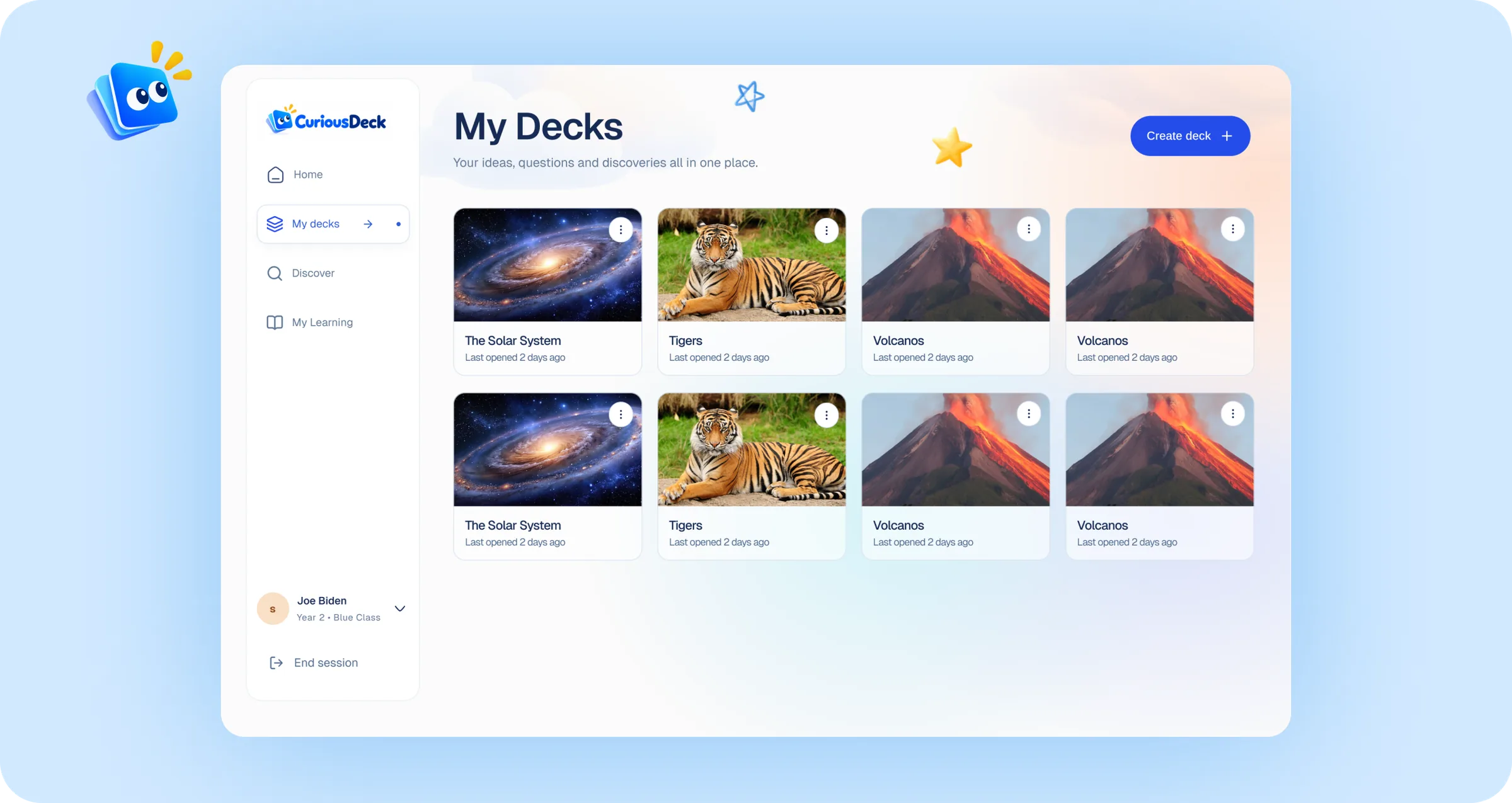
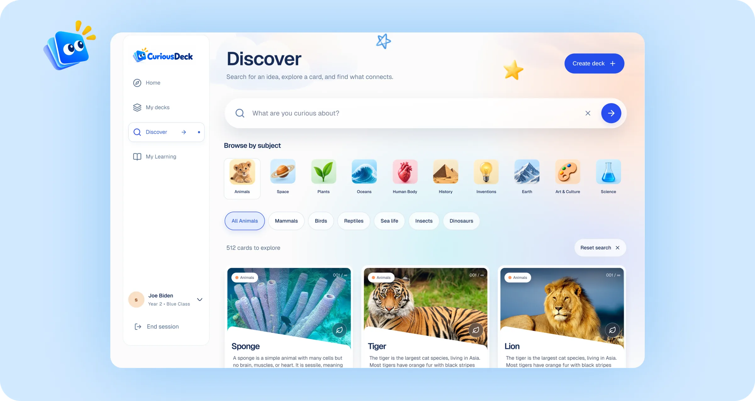
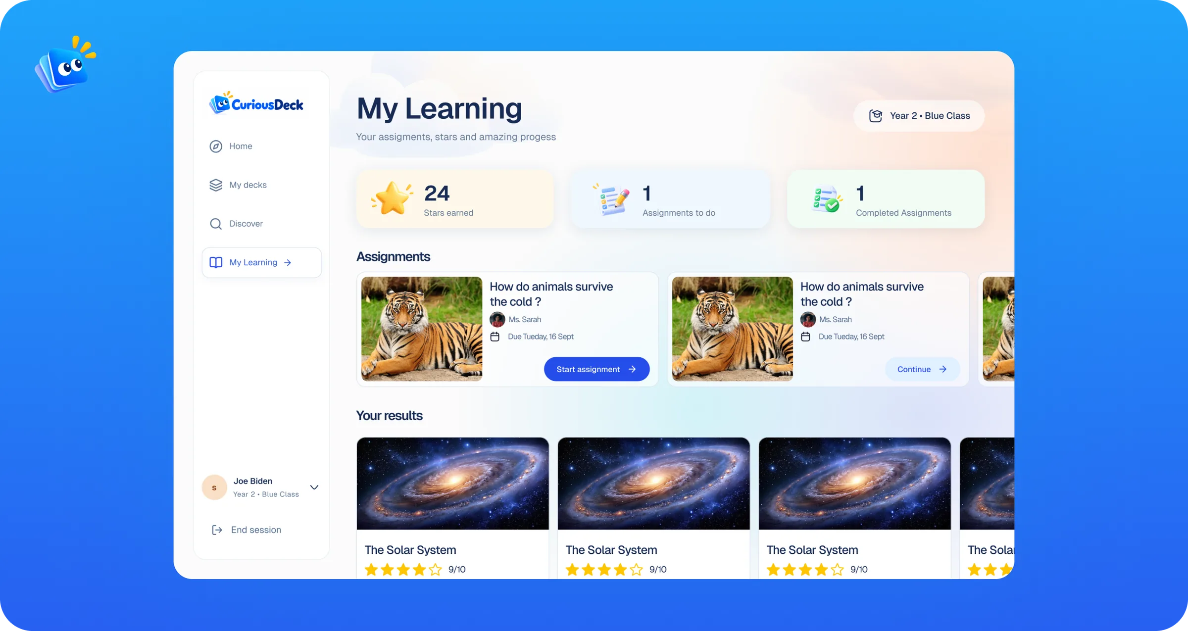
Rather than keeping everything inside a single workspace, I separated the learner experience into distinct spaces for creating, discovering and tracking progress. This gave children clearer ways to move through the product while keeping the overall experience connected.
My decks
A personal space where learners can create new decks, return to previous questions and continue unfinished explorations.
Discover
A visual library of topics that helps children find something interesting to explore without needing to begin with a question of their own.
My learning
A simple view of assignments, completed activities, stars and teacher feedback—helping learners understand what they have achieved and what comes next.
OUTCOME / IMPACT
A clearer path from a question to a finished deck.
The redesign shipped a Home built around one question, four connected spacesHome, My Decks, Discover and My Learning and a visual system that feels inviting to young learners while keeping the learning content in focus.
REFLECTION
Designing for children is not about making everything more colourful. It is about making every choice easier to understand.
CuriousDeck challenged me to balance two very different needs: the freedom children need to follow their curiosity and the structure teachers need to guide learning. The strongest improvements came from giving each part of the experience a clear purpose, rather than adding more instructions or features.
The project also reinforced how important visual tone is when designing for younger users. The interface needed enough colour and personality to feel inviting, but enough restraint for questions, discoveries and learning content to remain the focus.
If I continued developing CuriousDeck, I would test the experience with children across different age groups and observe how independently they can begin a question, build a deck and understand their progress. I would also refine the teacher experience around assigning activities and reviewing what each learner discovered.