ATLAS CITY OPERATIONS
Designing one operational system for an entire city
ATLAS brings traffic monitoring, infrastructure management, notifications and field operations into one connected platform helping city teams understand what is happening and coordinate what needs to happen next.
My role: Lead product designer for two years. I owned the visual direction and the product interface across desktop and mobile.
SEED
FUNDED
2 YEARS
LEAD PRODUCT DESIGNER
4 CORE WORKFLOWS
FEATURED IN THIS CASE STUDY
OVERVIEW
The challenge was not putting more information on the screen. It was helping different city teams understand what needed their attention.
The founder contacted me through Upwork while ATLAS was still at seed stage. The product structure had already been established and an early homepage had been built, but the team needed a clearer visual direction and a designer who could complete the wider platform.
Over the next two years, I designed the product interface across traffic monitoring, infrastructure management, notifications, scheduling and field operations. The work began with screenshots and product references, then evolved through continuous feedback from city officials, traffic operators, field employees and the internal team.
- My role
- Lead Product Designer
- Industry
- GovTech · Smart City Operations
- Scope
- Visual direction · Product UX/UI · Desktop and mobile workflows
- Year
- 2024–present
THE PROBLEM
City teams needed one system, but each role needed something different from it.
Traffic monitoring, infrastructure, notifications and field work lived in separate tools. The product had to bring them together without overwhelming administrators, operators or field employees.
KEY DECISIONS
Three decisions shaped the platform.
- I refined the existing visual direction instead of replacing it, reserving bright colour for data, status and key actions.
- I separated information by role, so each person sees what they need for their next decision.
- I reduced Asset Management to one clear loop between an administrator and a field employee.
REFINING THE FIRST DIRECTION
The goal was not to remove the product's personality. It was to give the colour a clearer purpose.
When I joined ATLAS, the product already had an established structure and a visual direction the team liked. The dark interface and colourful data visualisations gave the platform a distinctive identity, but the amount of colour across cards, buttons and controls made the homepage feel visually intense.
My first task was to refine that direction rather than replace it. I kept the dark foundation and enough of the purple, pink and blue accents for the product to remain recognisable, while reducing the large gradients and using brighter colours more intentionally for data, status and important actions.
I also improved the organisation of the homepage, creating clearer groups for Scores, Asset Management, Live View, Traffic Count, Notifications and Intersection Health. The result retained the character of the original design while making the platform feel calmer, more structured and easier to scan.
BUILDING THE FIRST COMPLETE VERSION
The first version gave the idea a form people could finally see, test and believe in.
Once the homepage direction was established, the work expanded into the wider platform. ATLAS combined traffic monitoring, infrastructure management, employee activity and city operations in a way that did not have one direct product reference.
The founder shared feature ideas and screenshots from adjacent systems to explain how different capabilities could work. I translated those references into connected ATLAS dashboards, giving each feature its own purpose while keeping the navigation, visual language and interactions consistent across the product.
The first complete version made the wider product vision tangible. It gave the team something concrete to demonstrate to potential users and investors, and became part of the product presentation that supported ATLAS in securing its seed funding.
LEARNING THROUGH FEEDBACK
The product became clearer when I stopped treating every user like they needed the same dashboard.
The first version was not treated as the final answer. As the product developed, I showed successive versions to city officials, traffic operators, field employees and internal stakeholders. Feedback came through product calls, demonstrations and Figma comments, then informed the next round of design decisions.
One important pattern emerged: each role needed a different level of information. City administrators needed oversight and the ability to assign and confirm work. Traffic operators needed real-time monitoring and deeper operational detail. Field employees needed focused mobile tasks they could complete quickly while working on location.
This became especially clear during a conversation about Asset Management. What initially seemed like a complex infrastructure workflow could be reduced to a straightforward exchange between an administrator and a field employee. That insight shaped how I approached later versions of the platform: show each person what they need to make the next decision, rather than exposing the entire system at once.
CITY ADMINISTRATORS
Operational oversight
REVIEW · ASSIGN · CONFIRM
See priorities and coordinate the work.
TRAFFIC OPERATORS
Real-time operations
MONITOR · INVESTIGATE · RESPOND
Explore conditions and investigate issues.
FIELD EMPLOYEES
Focused mobile tasks
LOCATE · UPDATE · COMPLETE
Act on location without the full system.
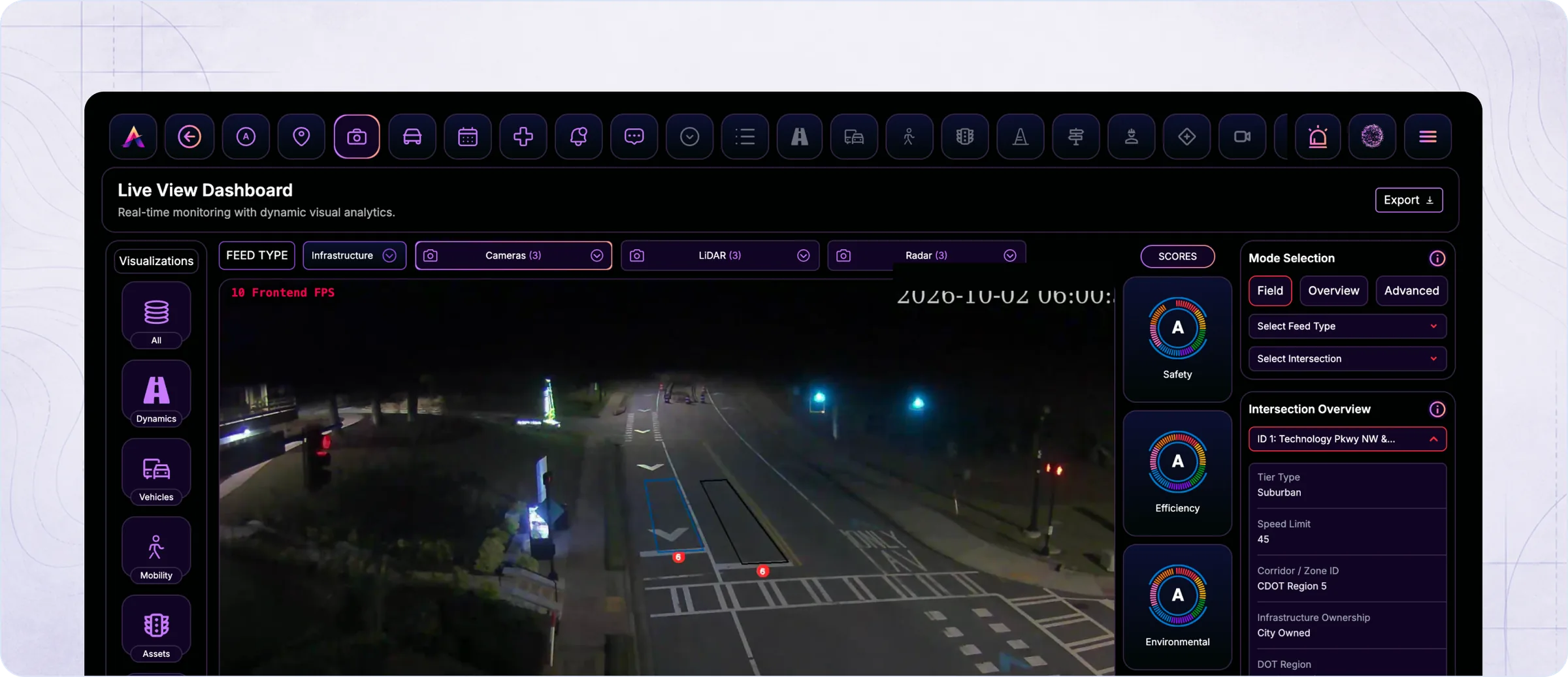
LIVE VIEW
The goal was not to show every available data point. It was to help operators notice where attention was needed.
Live View gives traffic operators a central view of what is happening across the city. It brings together intersection activity, traffic conditions, vehicle movement and emerging issues without requiring operators to move between separate systems.
The main design challenge was managing density. Operators needed access to detailed information, but displaying everything at once would make the dashboard difficult to scan during active operations.
Operators can choose what they want to monitor—from specific vehicle classes to mobility, infrastructure and construction—while visual overlays make lanes, movement counts and traffic elements easier to interpret in real time.
ASSET MANAGEMENT
The most difficult workflow became one of the simplest once I understood what each person actually needed to do.
Asset Management was the most unfamiliar part of the product for me. I needed to understand how city teams track physical infrastructure, report faults, assign maintenance work and confirm that an issue has been resolved.
My initial research suggested a complicated system with detailed asset records, lifecycle information and multiple operational states. However, a conversation with a city official helped reduce the core experience to one clear exchange between an administrator and a field employee.
The administrator identifies an issue and creates a work order. The assigned employee receives the task on their phone, travels to the location and scans the QR code attached to the asset. After completing the repair, they add a brief update and mark the task as complete. The administrator can then review and confirm the work.
- 01Admin identifies an issue
- 02Admin creates a work order
- 03Employee locates and scans the asset
- 04Employee completes the work and adds an update
- 05Admin reviews and confirms completion
NOTIFICATIONS
Not every notification requires the same level of attention.
ATLAS receives updates from different parts of city operations, including maintenance issues, traffic violations, congestion, crashes and responder activity. Without a clear structure, important events could easily become buried in a long list of routine updates.
I organised the Notification Center around recognisable categories, making it easier for users to narrow the feed to the type of activity they were responsible for. Notifications could also be viewed at team or employee level, helping administrators understand both wider operational activity and individual updates.
The goal was to make a large volume of information easier to scan without removing the context users needed to decide what required attention next.
SCHEDULING AND EMPLOYEE ACTIVITY
Planning the work was only useful if administrators could also see what happened afterward.
Scheduling and employee activity needed to work as one connected experience. Administrators required a clear view of upcoming work, employee availability and active assignments, while field employees needed a simpler way to understand and update their day.
I designed the administrative dashboard around the information needed for coordination: scheduled activities, attendance, task status and employee progress. The mobile experience was intentionally more focused, allowing employees to clock in, view assigned work and move a task from Started to In Progress and finally Completed.
Keeping both sides connected meant administrators could follow operational progress without requiring constant calls or manual updates from employees working across the city.
- START
- IN PROGRESS
- COMPLETE
- ADMIN CONFIRMS
OUTCOME / IMPACT
A complete product, designed end to end.
The first complete version became part of the product presentation that supported ATLAS in securing its seed funding. The platform is fully developed and in pre-launch testing with city teams.
REFLECTION
Designing for a city does not mean showing everything—it means helping each person understand what they need to do next.
ATLAS was the first city-operations platform I had designed, and many of its workflows particularly traffic monitoring and asset management were completely unfamiliar to me when I began.
The project taught me how to work through an unfamiliar technical domain without allowing that complexity to take over the experience. I learned when to question requests for more functionality, how to separate information by user role and how valuable direct feedback becomes when designing operational tools.
I am most proud that I was able to design the complete product experience across desktop and mobile, turning scattered references and evolving requirements into a connected system that could be developed and tested with real city teams.
If ATLAS launched tomorrow, my next priority would be testing and refining the complete Asset Management work-order loop—from an administrator creating the task to a field employee completing it and the administrator confirming the result. It is one of the platform’s most important workflows, and the area where small improvements could have the greatest operational impact.